Papiton – newsletter redesign
Company.
Papiton
Work.
Content Design & Brand Strategy.
Situation.
Papiton's weekly newsletter is a valuable direct channel to existing customers - but with multiple brands, product highlights, and seasonal content competing for attention, the layout had grown dense over time. Headlines and brand names were baked directly into images using one uniform font, which hurt readability and made every brand visually indistinguishable from the next. Combined with a generally cluttered, unstructured layout, key messages didn't always land with the clarity they deserved.
The idea.
Redesign the newsletter to actually land, not just inform. Less is more: sharper audience focus, reduced visual noise, and a brand strategy that gives each label in the portfolio its own distinct visual identity without losing overall coherence.
The execution.
Full brand and layout redesign – built entirely in HTML through Papiton's own in-house newsletter tool, giving full creative flexibility (e.g. freely integrating GIFs) without template constraints. Moved text out of images into live, accessible HTML copy, instantly improving readability. Solved the brand-distinction problem by systematically integrating each brand's actual logo instead of relying on uniform image-text – effectively building a newsletter design system from the ground up. Cleaner structure, reduced and consistent visuals, clear content hierarchy. Sharpened brand-specific tone and reusable copy modules, benchmarked against current e-commerce newsletter standards. As part of the redesign, we also implemented proper tracking infrastructure – open rates, CTR, and click-to-open rates are now being measured for the first time, creating the foundation for data-driven iteration going forward.
Before the redesign.
Text and products baked into images throughout, instead of live HTML text: Poor readability, not scalable, not accessible.
Inconsistent fonts across sections. No unified brand system, feels disjointed.
No visible brand logos (aside from Papiton at the top). Brands like Trollkids, Liewood, and Koel are only identifiable through text, not visual identity.
High density with no breathing room. Sections stacked directly on top of each other with no clear visual hierarchy or spacing.
Inconsistent CTA buttons. No cohesive interaction system.
Arbitrary image crops. No consistent image grid.
Discount messaging placed inconsistently. Makes it harder for customers to scan quickly.

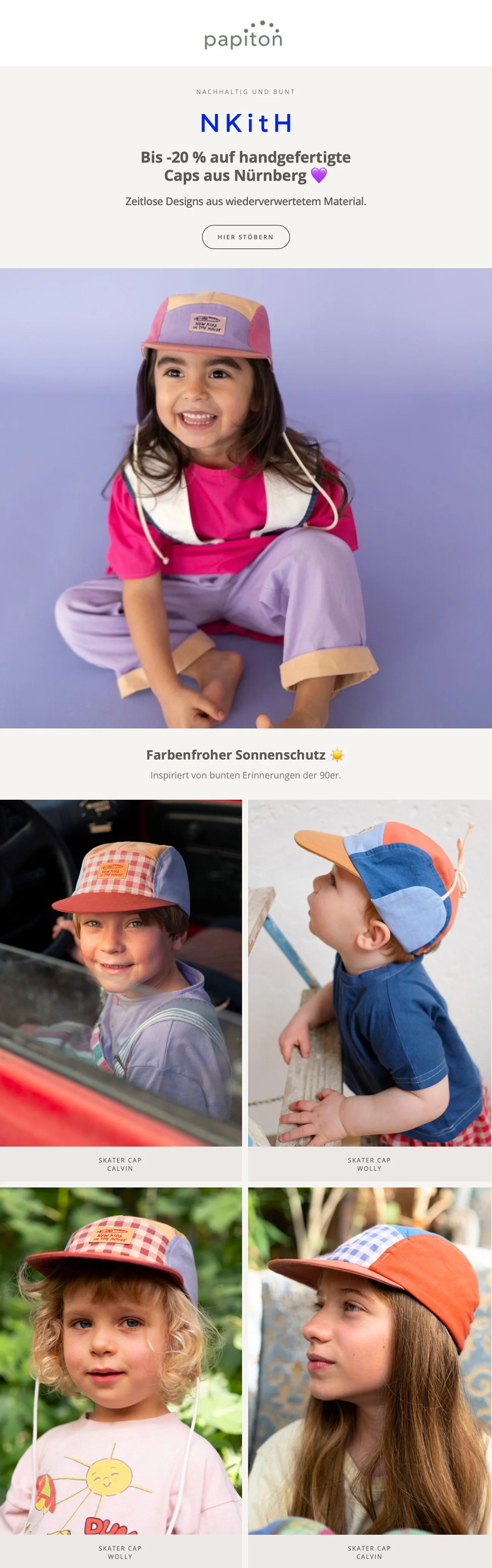
After the redesign.
Live HTML text throughout instead of text baked into images. Fully readable, scalable, and accessible.
Consistent typography across all sections. A single, unified type system instead of a different font per brand.
Clear brand logo placement. Brand identity established visually, not just through text.
Generous white space and clear visual hierarchy. Sections breathe, eyebrow/headline/subline structure guides the eye top to bottom.
One consistent CTA style. A cohesive, recognizable interaction pattern throughout.
Uniform image grid for product shots. Consistent cropping and aspect ratios across the 2x2 product grid.
Discount and offer messaging placed predictably at the top of each module. Easy to scan at a glance.