Martha Harms is a Senior Brand and Digital Designer – passionate about creating sustainable and purposeful design solutions that combine aesthetics, clarity, and long-term impact.

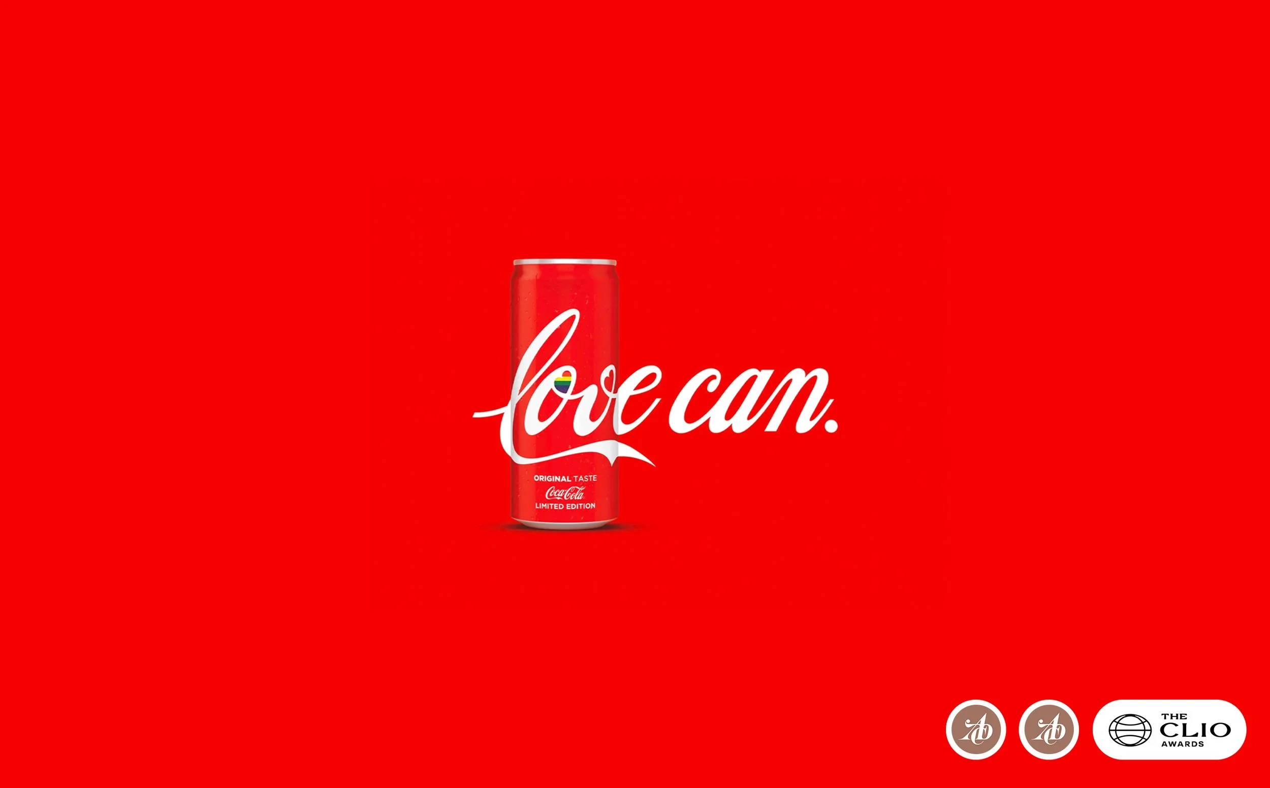
Coca Cola – love can campaign
A bold typographic campaign for Coca-Cola that turned a simple can into a powerful statement – showing that love can achieve more than hate.
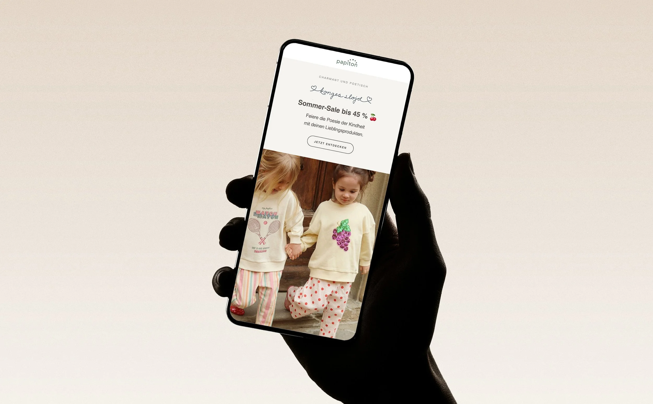
Papiton – newsletter redesign
Papiton's weekly newsletter connects the brand with its existing customers across multiple children's clothing lines. The redesign rebuilt it entirely in HTML, replacing image-based text with live, accessible copy and a consistent design system that gives each brand its own visual identity, supporting clearer communication and measurable performance going forward.
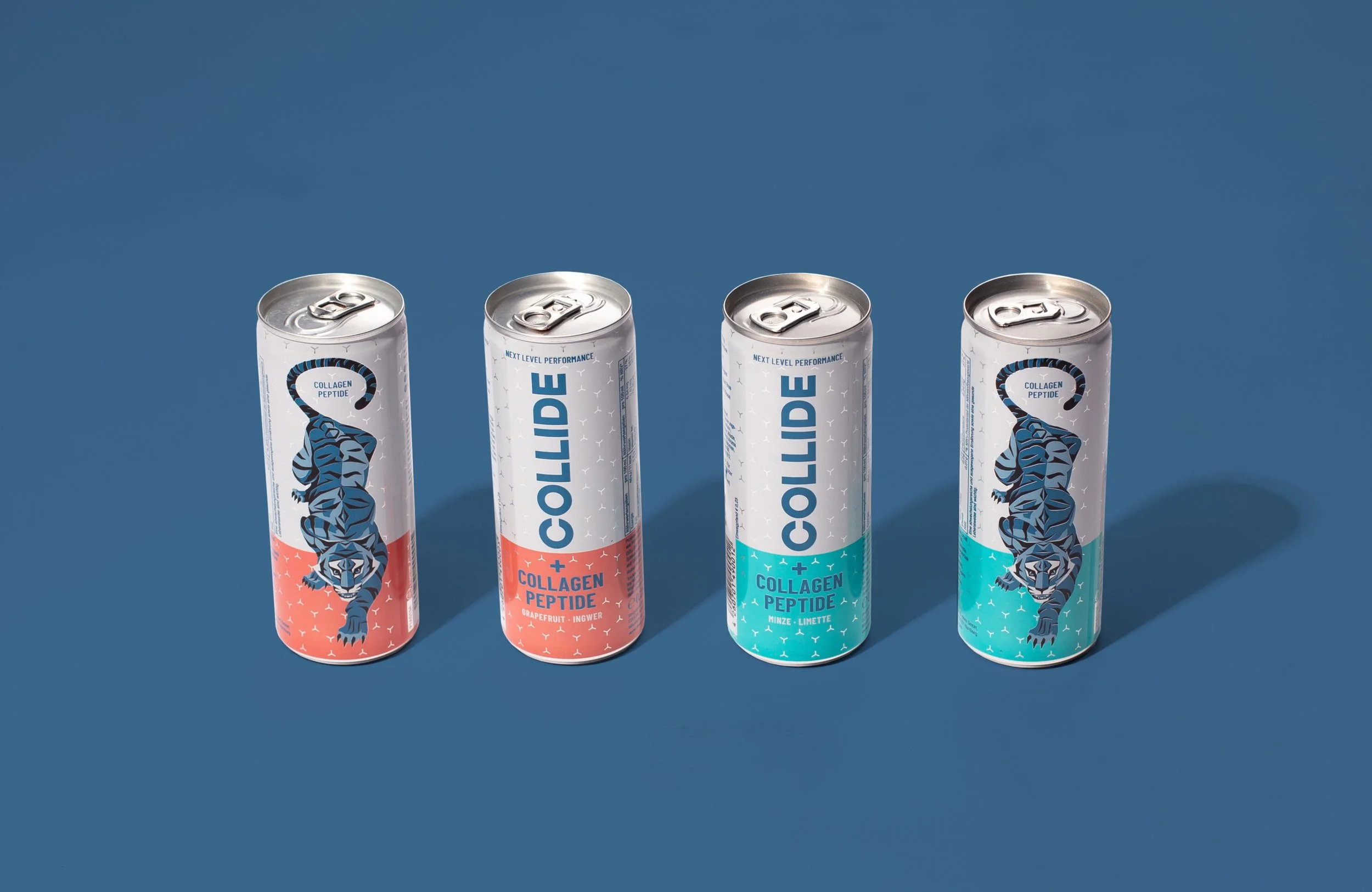
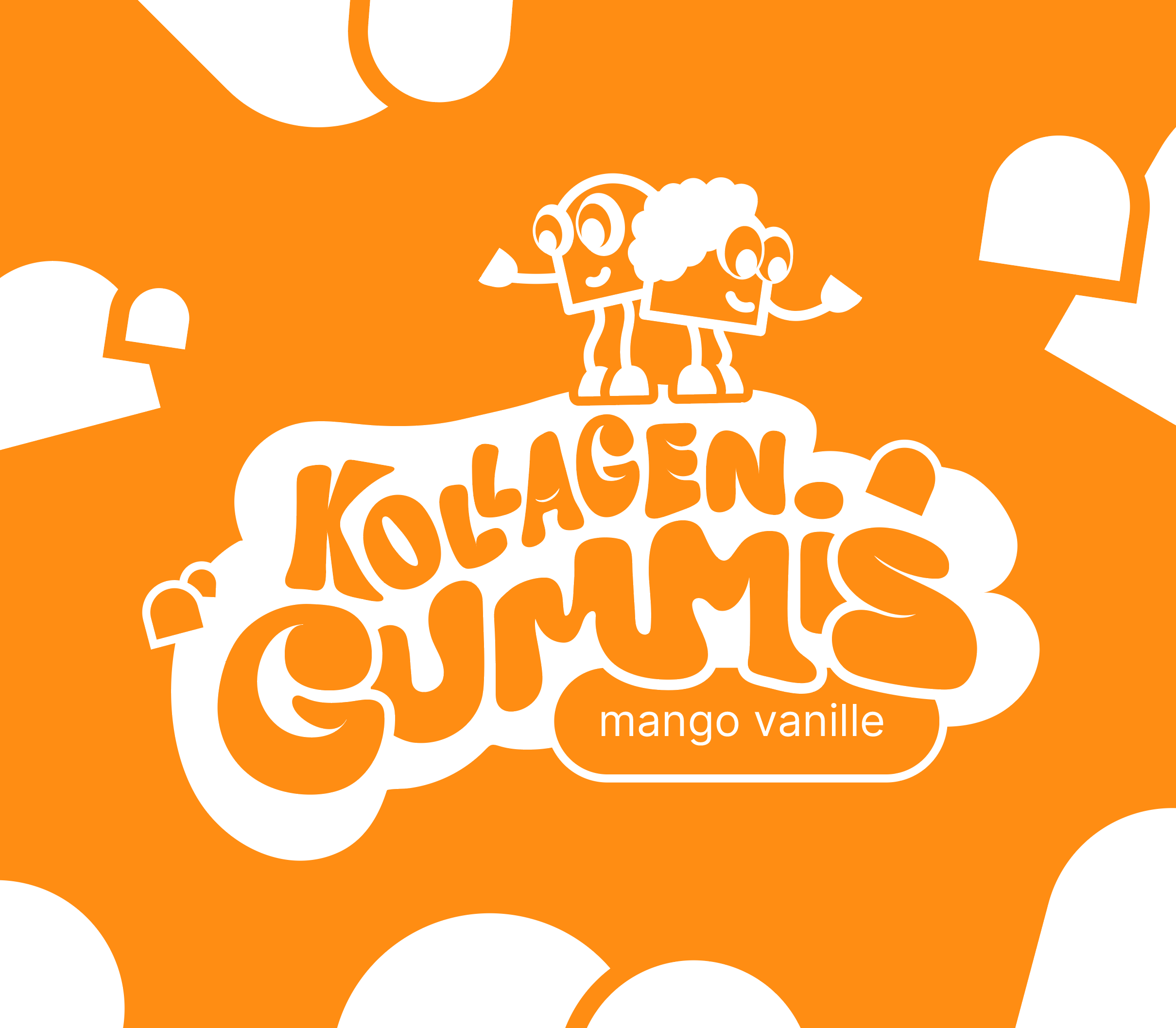
COLLIDE – brand design & strategy
COLLIDE is the world's first performance drink made with collagen instead of protein or caffeine. Building on an existing logo, the brand system was evolved into a bold, energetic identity – from can photography and packaging to paid social and Instagram content. Every touchpoint, from shelf to feed, reflects performance, edge and unmistakable presence.
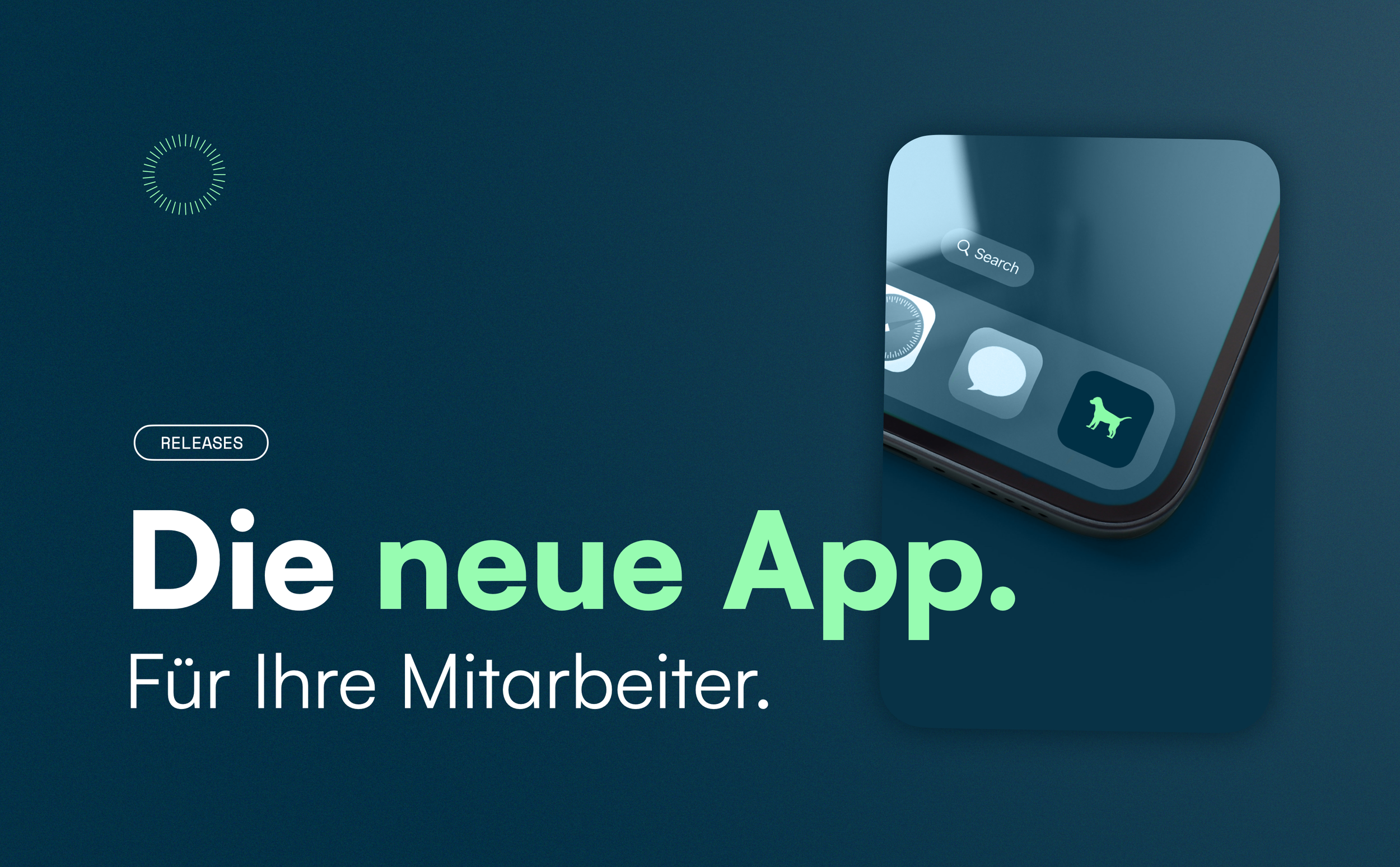
askDANTE – brand design
askDANTE is a time tracking tool that helps businesses manage working hours with clarity and efficiency. It combines intuitive tracking, smart planning features, and a structured overview of time data to support better decision-making and everyday workflows.
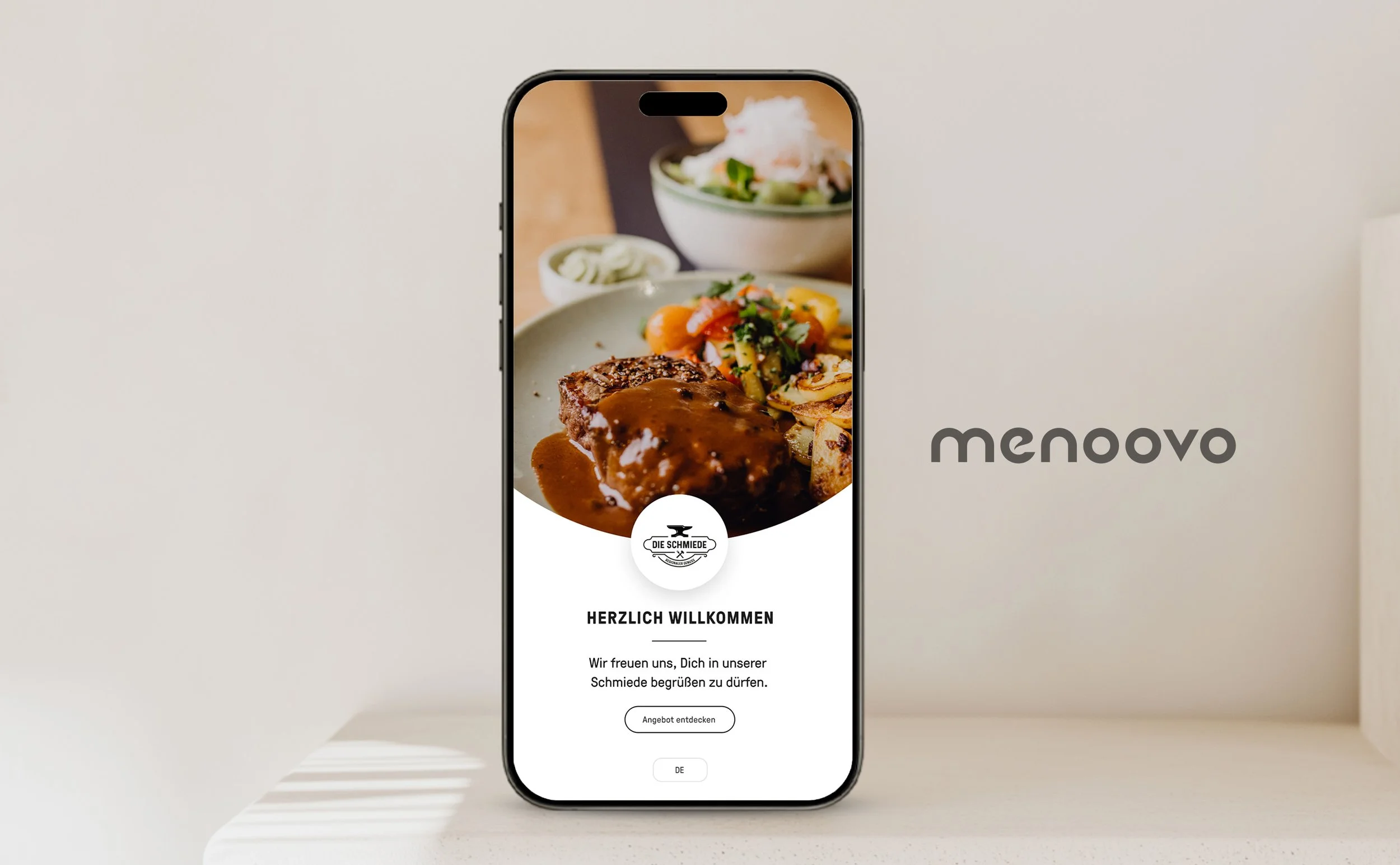
menoovo – brand design
A refined brand design that rethinks how guests interact with gastronomy. Smart digital touchpoints connect people, food, and recommendations in one seamless flow – so that dining becomes more intuitive, personal, and engaging.

Luna Éclat – brand design
A brand identity reimagining modern luxury through a timeless and elegant lens. Inspired by the moon’s ethereal beauty, the design combines clean lines, subtle symbolism and a soft, sophisticated palette. Every detail reflects a balance of femininity, quality and understated luxury.

Dennis Habermann – brand design
A personal brand identity for Dennis Habermann, sales manager, built on clarity and quiet confidence. The monogram folds his initials into one continuous line, paired with a deep violet grounded by a soft mint accent for warmth. Every touchpoint, from business card to signature, reflects precision, trust and modern professionalism.


Stromtalente – brand illustrations
A bold isometric visual system that makes a complex recruiting process within the electrical industry easy to grasp. Monochrome design meets depth and clarity to guide the viewer through every step. Created to turn hiring into a clear and engaging experience.
Type explorations
A personal series of typographic explorations – pushing letterforms beyond convention to see where they develop a voice of their own.
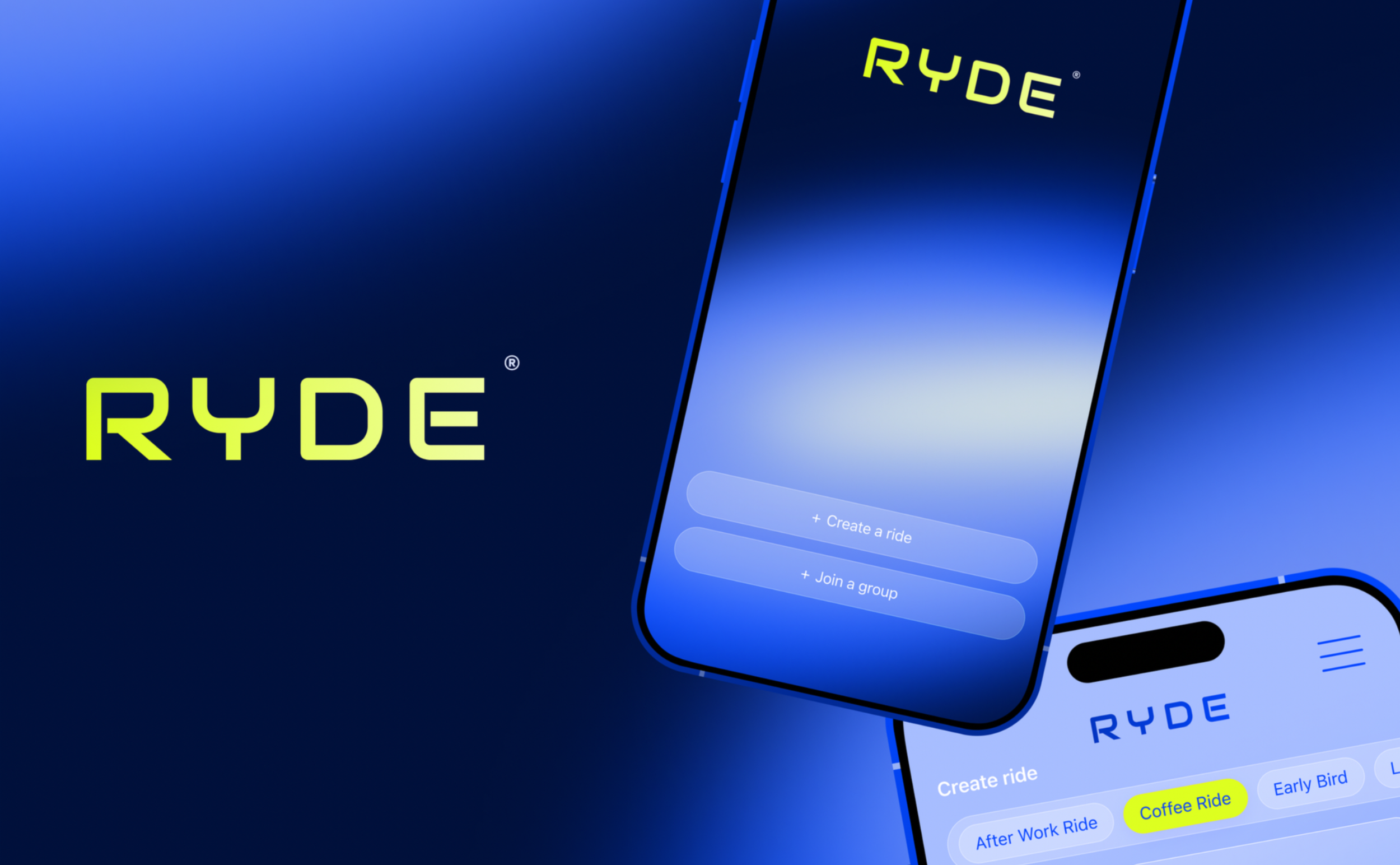
RYDE – brand & app concept
Ryde is a community-driven cycling app that makes it easy to connect with riders nearby. Whether it’s a coffee ride or a Sunday sprint – Ryde helps you share the pace and flow as one.
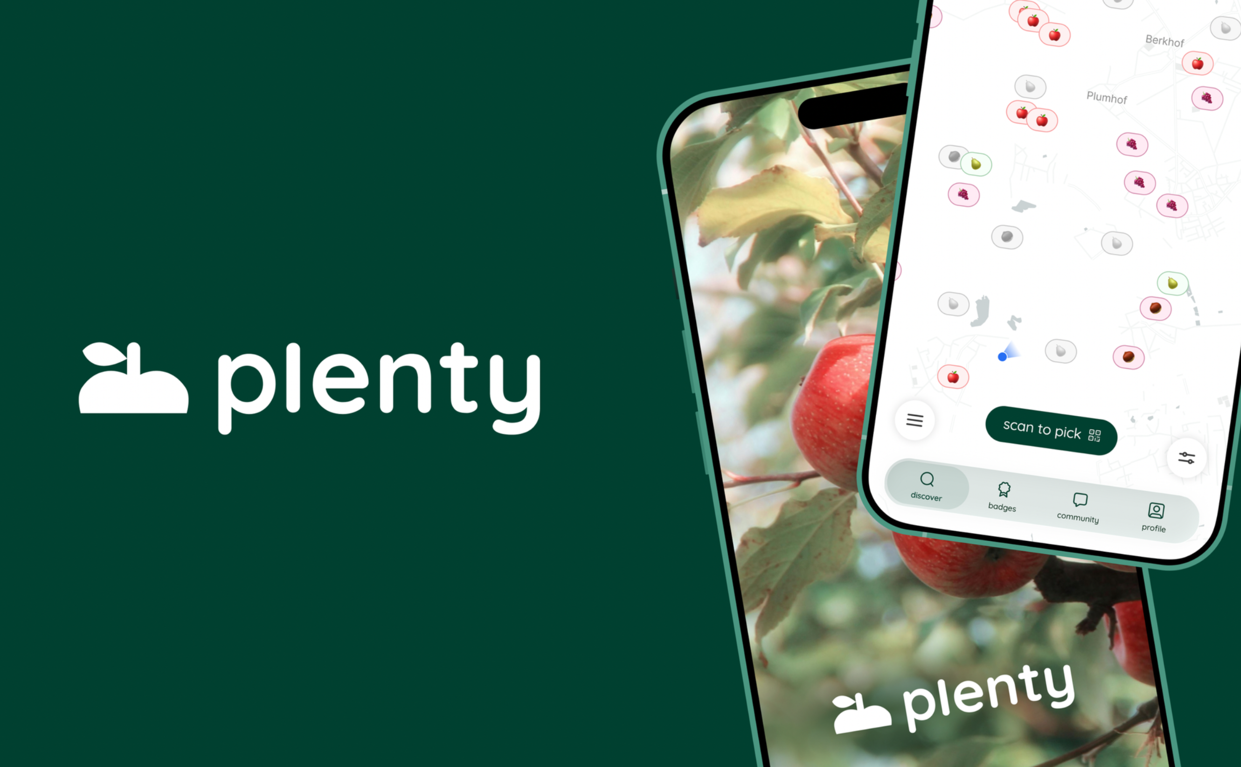
plenty – brand & app concept
Plenty makes nature’s abundance visible by helping people discover and share fruit that would otherwise go to waste. A live map, community features and simple interactions connect people, promote sustainability and turn harvesting into a shared experience.