Heidekreis Athletik – brand design
Situation.
Heidekreis Athletik, a CrossFit box based in Soltau, had built a strong community and a growing presence, with a solid logo as their visual foundation. What was missing was a cohesive brand system to match their ambition: A defined visual language that could scale across channels, merchandise, and communications, and give their community a consistent, recognizable identity to rally behind.
The idea.
Expand the existing brand foundation into a full, scalable identity system – one that captures the raw, unfiltered energy of the box and translates consistently across every physical and digital touchpoint. Heidekreis Athletik has a distinct character: A backyard-garage vibe, world-class weightlifters, and a sport that is loud by nature. The brand needed to look the part.
The execution.
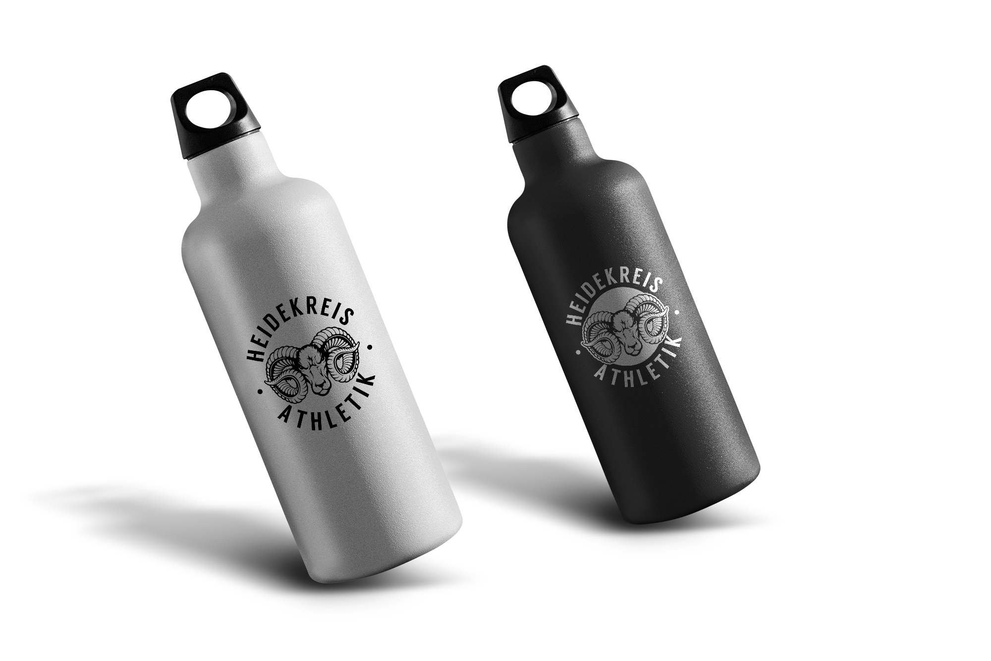
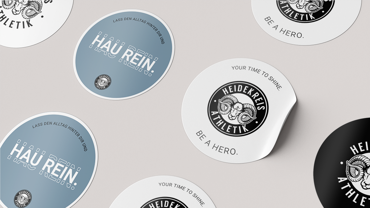
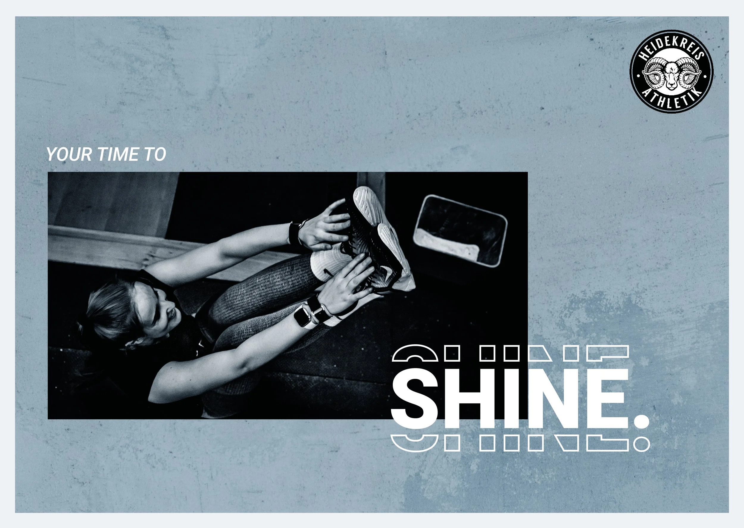
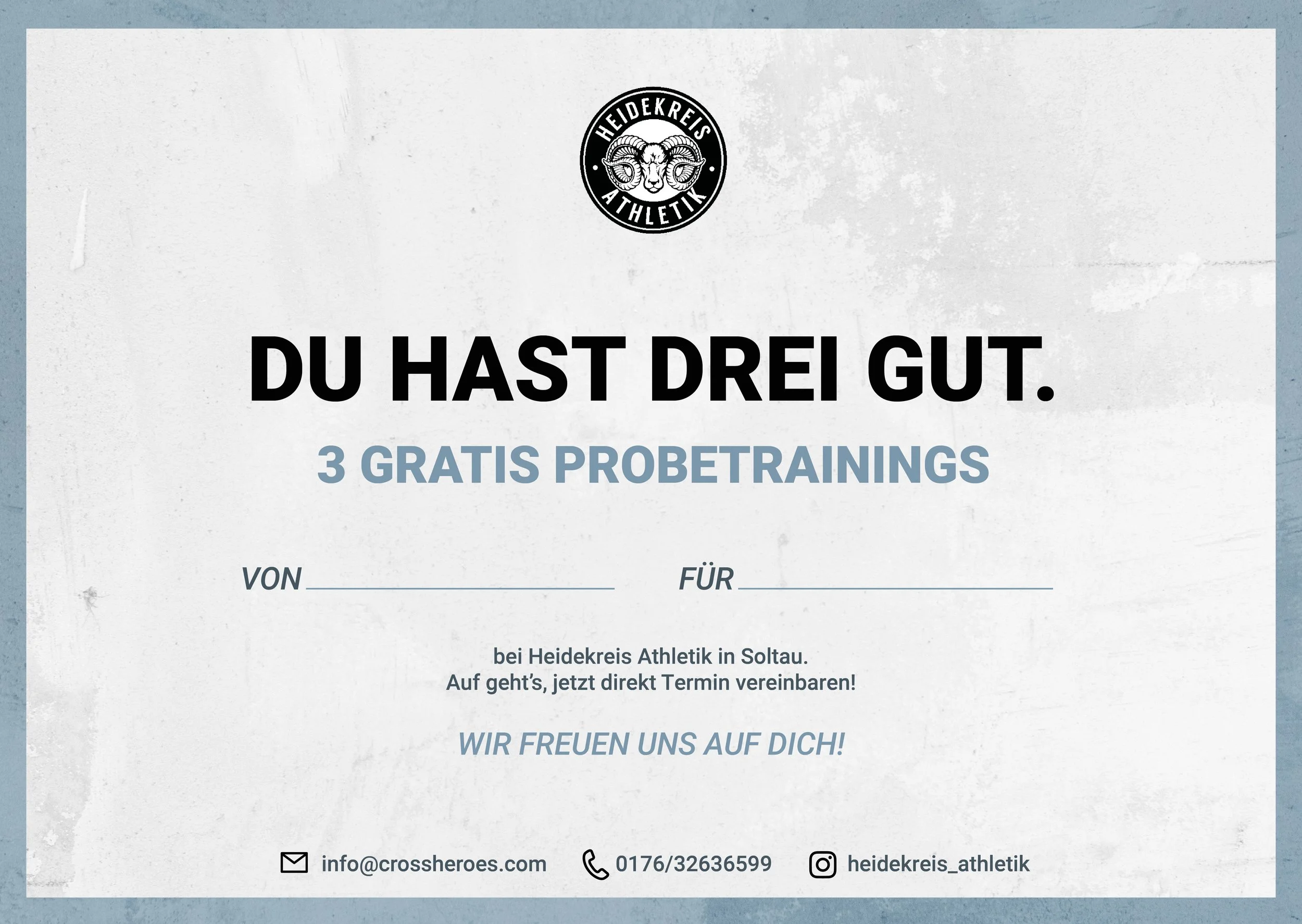
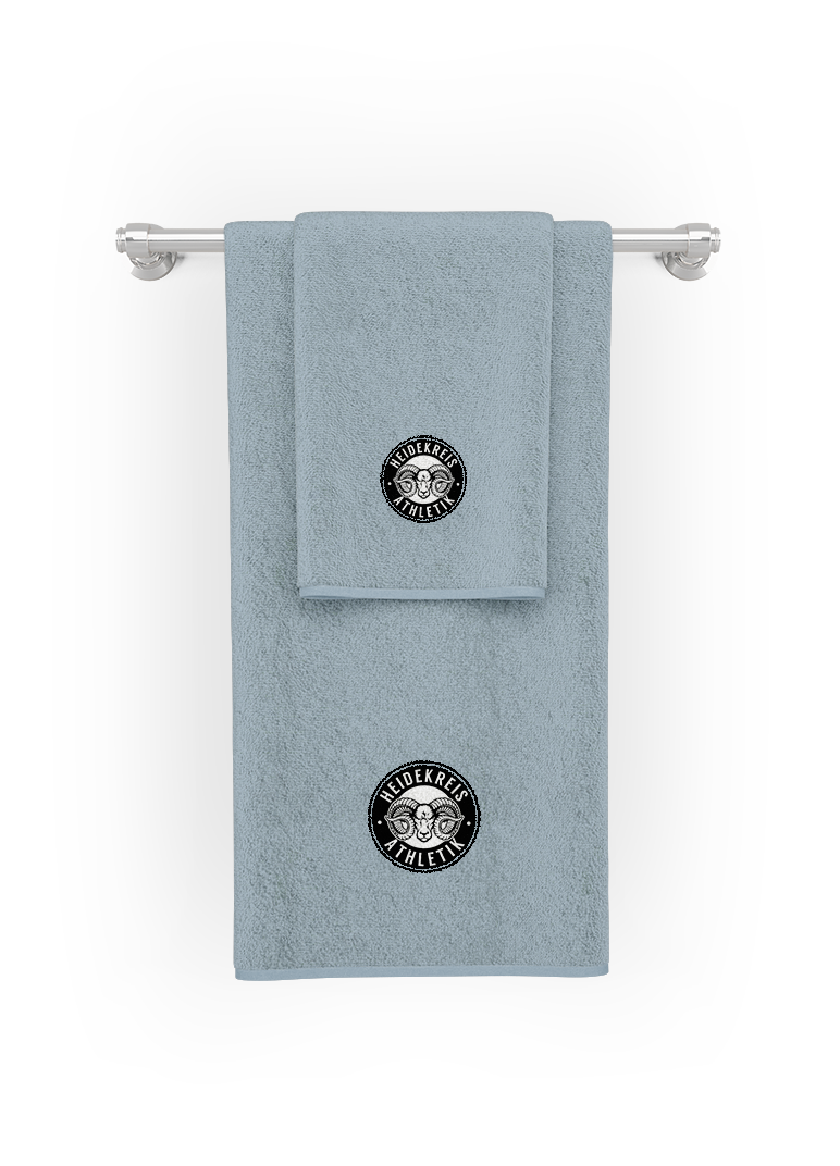
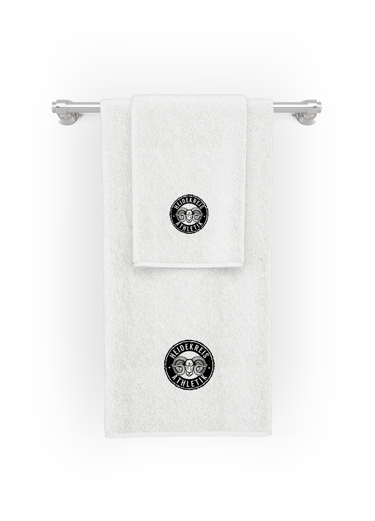
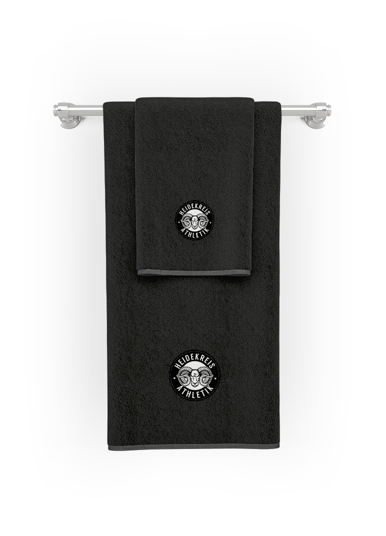
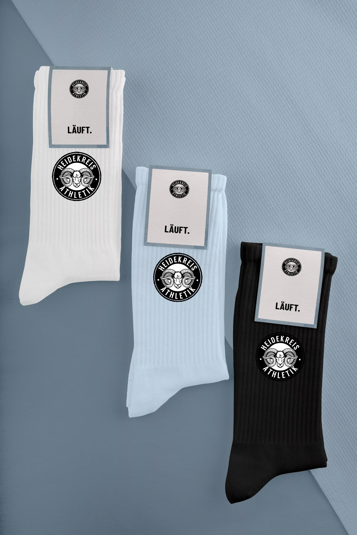
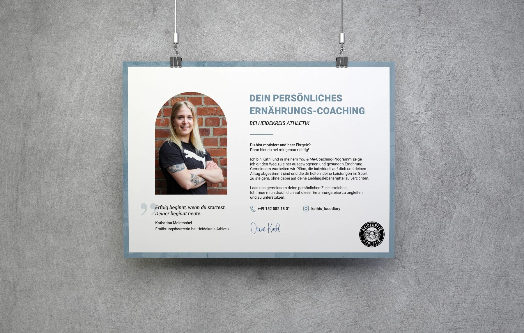
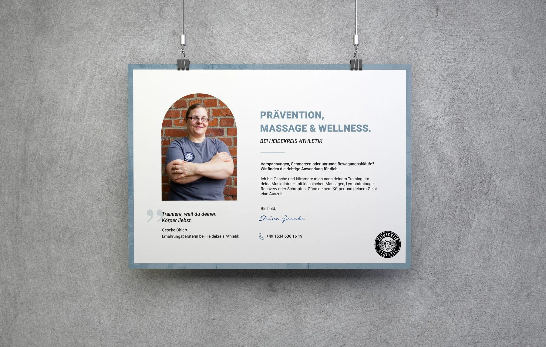
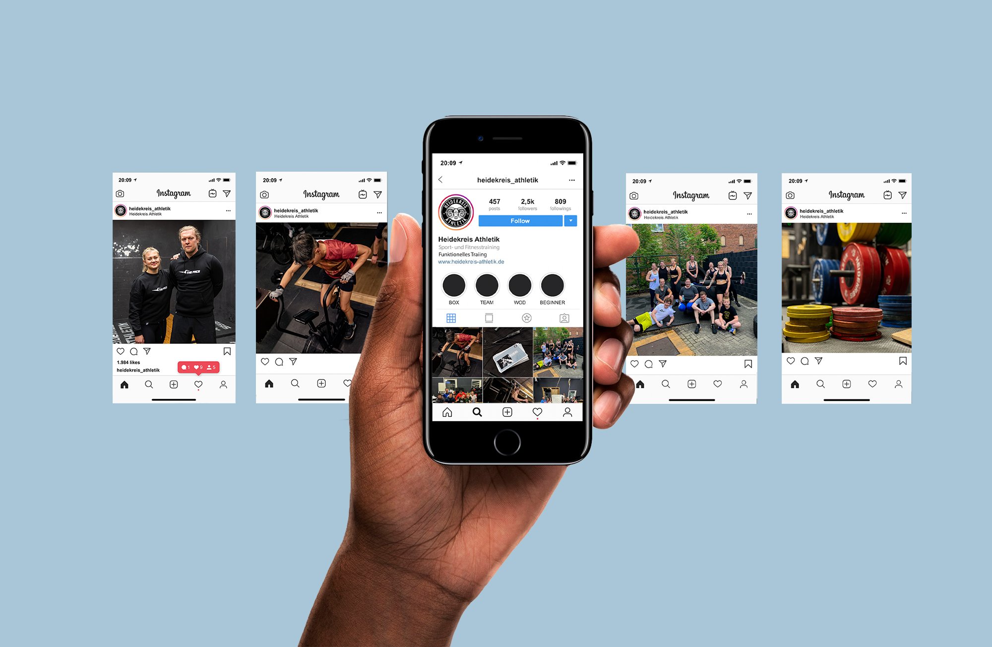
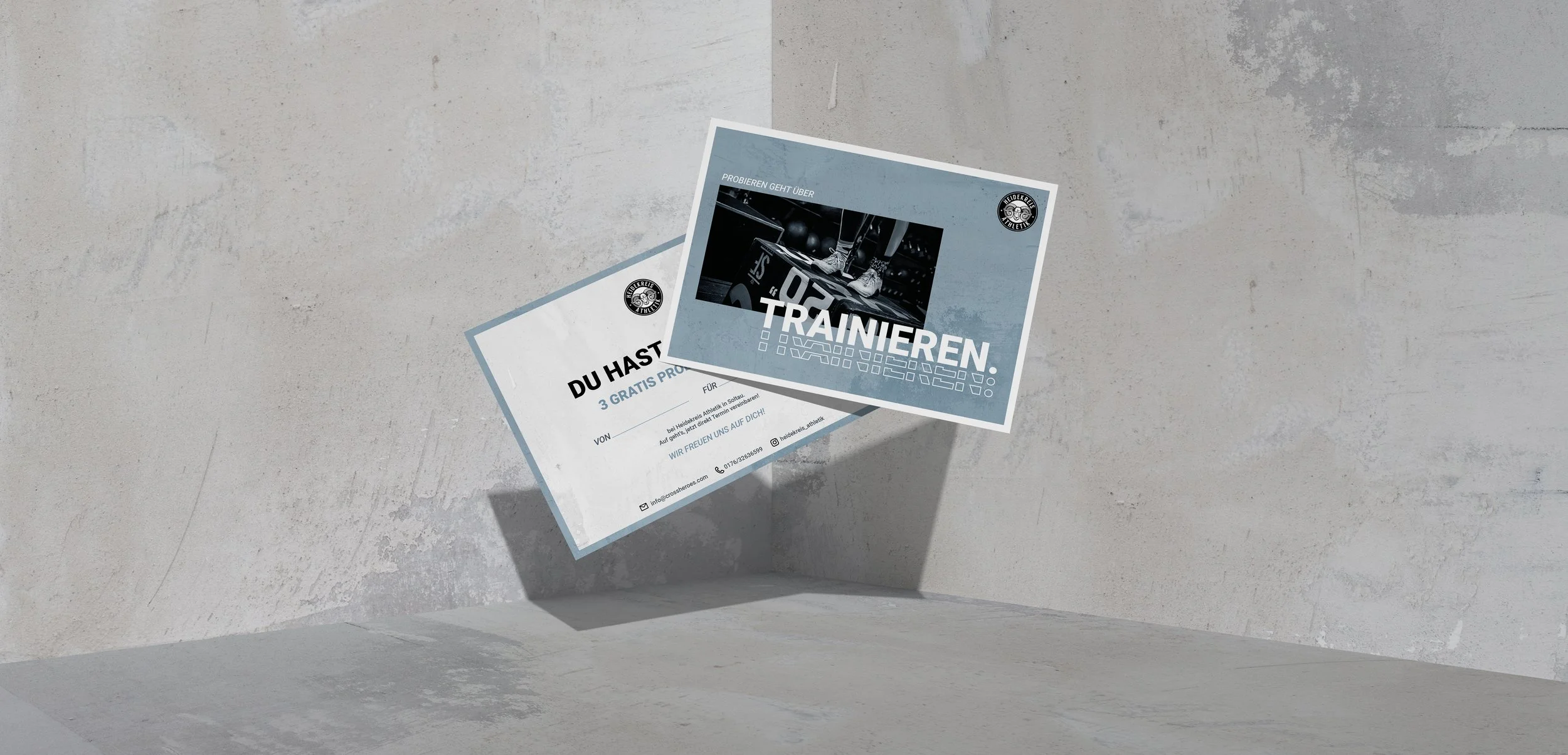
Developed the complete brand system as a freelance project: Defined color palette, typography, and visual language built on the existing logo – with a deliberate nod to the rough, high-intensity culture of the box. Bold typographic choices reflect the physicality of the sport. Rolled out across merchandise, social media strategy, and internal master layout templates – creating a coherent visual world that works as hard as the athletes wearing it.